Redesign of SARA Sanctuary
“We have around 6000 people who visit our website each month. There are a few determined supporters who will email me to send us a physical check because the donation process doesn’t work. How many of those 6000 people experienced the same thing?”
We were tasked with redesigning the website for SARA Sanctuary, an animal sanctuary dedicated to rescuing animals and helping them transition to a better home, where some of the main pain points were a complicated donation process and a website that lacked trust.

Timeline
3 weeks
Team
Kayla, Sinclar, & Andy
Project Type
Website Redesign
Roles
User Researcher, UX/UI Designer
User Research
I started off my research with 2 of our 5 usability tests that focused on some issues we thought the website might have. I also made the survey with questions like why people support non-profits and what they would like to see on their websites.
Some of the insights that we found were:
Visitors found it difficult to locate the mission of SARA, which is a top priority for supporters of non-profit organizations
Visitors felt the website was not trustworthy when they would be taken to another website to process their donation
Supporters of non-profit organizations want to know where their money is going
During this process, I also conducted a stakeholder interview where I uncovered these main insights:
Tone should be positive, but still impactful.
The donation process has been very difficult for the website’s visitors.
Top priorities are donations, volunteers, and adoptions.
Definition & Synthesis
With the all of the interviews in mind, my team and I put together an Affinity Diagram that helped us empathize with the visitors of SARA Sanctuary and see what they were feeling.
We realized that SARA's visitors were wanting these top three things:
"I want the mission to be clear to me."
"I need to know that what I donate to is trustworthy."
"I need a page that shows all of the ways that I can donate."
Based off of the insights we had gained, we were able to formulate the:
Problem
We have observed that SARA's website isn't building trust with the visitors to donate and meet the animals, which is causing many visitors to leave the site and not donate to the non-profit.
Solution
How might we simplify the home page, create a more user-friendly donations page, and make the website more trustworthy?
Ideation
After conducting our research, we created a user-persona that encompasses the main things our users were feeling. Emily Patterson represents a large majority of who visits SARA Sanctuary's website.
Some things about Emily:
She wants to know where her donation is going.
The website needs to be trustworthy because everything is online now.
Doesn't like complicated websites.
Doesn't want to feel like she is being scammed.
After we created our user-persona, Emily, I applied our research and findings to see what a journey for her would look like as she tried to make a donation to SARA Sanctuary.
As she encountered different pain points on the website, we brainstormed different opportunities we could take:
Place the mission statement on the homepage so it is the first thing that visitors see to gain an understanding of who SARA is.
Remove the "donate" button that followers the visitor as they go throughout the site and just create a donation page instead.
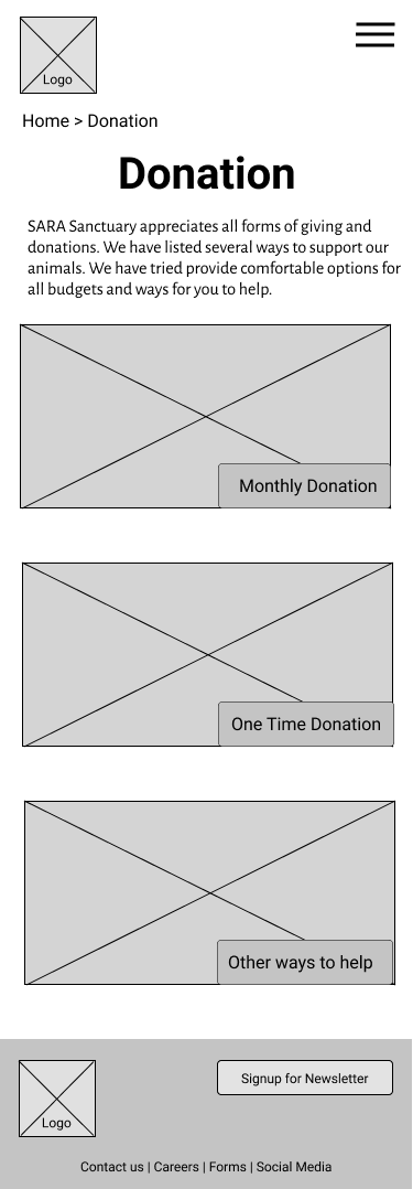
Simplify the initial donations page to only three options instead of ten since it can be overwhelming to a user.
Include a login/signup process so that donors can manage their donations easier
Lofi Prototyping & Testing
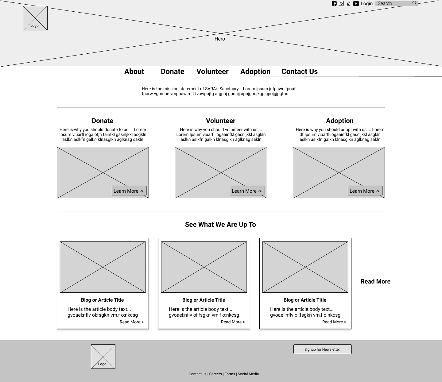
The stakeholder pointed out that the majority of the visitors were on their mobile device when they viewed their website, so I began with making mobile-first wireframes. Based on our research, the homepage would have the mission statement, the top priorities the stakeholder wanted for the website, and the blog section at the bottom so that visitors could see their animals and connect with them.
The initial donations page was then simplified into three different options: "Monthly Donations", "One-Time Donations", and "Other Ways to Help". Based on our research, I knew that simplifying this initial page would reduce frustrations the visitor may have and could potentially increase the amount of donor traffic.
We then created a clickable prototype of our wireframes and tested 5 users. For the majority, making a donation was fairly easy, but there were still some iterations needed. Some of the insights that would be turned into iterations were:
Users were confused with the location of the "Create Account" section, so we moved it to when the user first clicked on the "Donate" page.
We needed to create clearer visual hierarchy to guide the user better.
We included a search bar on the homepage instead of being on the side menu bar.
Style Guide
With one portion of usability tests and iterations down, we started to work on the Style Guide for SARA's Sanctuary. We fortunately had the opportunity to have the original style guide sent to us from the stakeholder. With keeping this one in mind and the voice/tone the stakeholder wanted for the website, I helped to create the new style guide for the organization.
Some things that we implemented:
Reducing down to 2 fonts that stayed within SARA’s tone
Focusing on colors that created trust and encouraged visitors to donate
Old Style Guide
New Style Guide
Final Prototypes
We tested our prototype one final time to work out any problems there may have been. On the desktop version, I got rid of the "Read More" section for the blogs at the bottom and aligned the cards properly and also made all of the photos clickable.
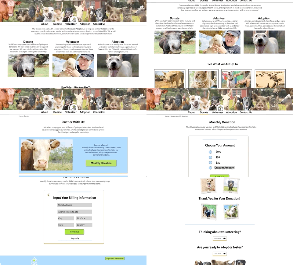
For mobile and desktop versions, we added a billing section to create a more accurate donation process. We also added a call-to-action section on the final "thank you" page to encourage the visitor to look at the other priorities the stakeholders had.
Conclusion
Overall, we are very satisfied with the new website that we created and had 100% success rates on the final two versions of the prototypes my team made. It was fun learning how to collaborate and brainstorm ideas with other designers to help our stakeholders reach their goal.
Some of the future opportunities we are thinking about are:
Create fun animations on the page to continue with the "positive" voice of SARA
Brainstorm ideas on how donors can still interact with the animals through the website since they are not able to visit due to COVID
Create a "Blog" page instead of a section on the homepage
Thanks for reviewing my case study! Want to chat?


